Illustrators # 12 (magazine review).

(c) The Book Palace
Jumping back to last year, we have Illustrator # 12, again with a spectrum of art talent, so there should be something here to interest most of you. The first two are digital artists with a divergent technique, although both have been influenced by animation.

(c) The Book Palace
Andrew ‘Android’ Jones digitally paints with an eye for fine detail texturing that isn’t likely to be as apparent with the example here than if you have this magazine in front of you. Certainly, his dimensionality owes a lot to his work in animation and he definitely likes the surreal.

(c) The Book Palace
Denis Zilber, in contrast, has an almost cartoony approach to his digital paintings, which when you consider he was brought up in the USSR which never had animation growing up makes him more remarkable. He also has a taste for sight gags and for someone who professes a lack of interest in SF and fantasy, there’s a couple in this selection of the latter. Again, he’s an artist happy to adapt to his commissions as much as paint for fun.

(c) The Book Palace
In many respects, comicbook artist Howard Chaykin could be seen as an acquired taste. Even he admits it took him a long time to learn to draw well and reading his interview, back in the 70s, he wasn’t particularly good with deadlines. He did, however, impress George Lucas with ‘Cody Starbuck’ for ‘Outreach Comics’ and who created a certain Han Solo based on the character which got him the gig drawing the first six issues of Marvel Comics’ adaptation of ‘Star Wars’. I always felt that adaptation was rather skimpily illustrated and Chaykin admits it wasn’t his best work. Even so, the contrast to his ‘First Comics’ ‘American Flagg’ caught everyone’s attention, showing his writing as well as artistic talent. In those days, we expected the independent comicbook companies to allow a different texture than the main two which Chaykin took to his advantage. I was less sure about his ‘Black Kiss’ material but, at the time, I suspect a lot of comicbook fans were as well. Seeing the range of Chaykin’s material here is, shall we say, an interesting experience and I’m saying more than usual because I’m familiar with his art.

(c) The Book Palace
A swing back to the start of the last century and we have the artist Sidney Sime, whose work covers several mediums and styles. There’s something oddly bewitching about his art and he obviously loved going into fine detail. Yet a portrait of his wife is so traditional, you wouldn’t have thought it was the same painter.

(c) The Book Palace
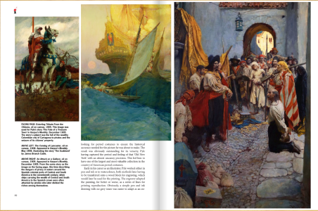
Ron Murphy is one of those natural talents that never went to art class but considering the number of influence he cites, I suspect it was more to do with good observation which you can match to the samples shown here. Pay particular attention to the top left picture on the page I selected and either turn your computer screen upside down or look over the top down at it. This is a very old-fashioned sight gag that isn’t revealed in the text but a reminder to pay attention to watch what you’re looking at.
There’s a lot to be learnt from ‘Illustrators’ and I’m beginning to treat my monthly double dose of back issues as a ritual of enjoyment.
GF Willmetts
May 2016
(pub: The Book Palace, 2015. 98 page illustrated squarebound magazine. Price: £18.00 (UK), $21.99 (US). ISBN: 978-1-907081-31-6. ISSN: 2052-6520
check out website: www.thebookpalace.com


